Datavisualisation inspirations
The intent of this workshop was to find out what each member of the team has in mind when they talk about data visualisations. We decided to spend a little time expanding our horizons and sharing links together.
Paul Virilio - EXIT - “planetarium of the Anthropocene”
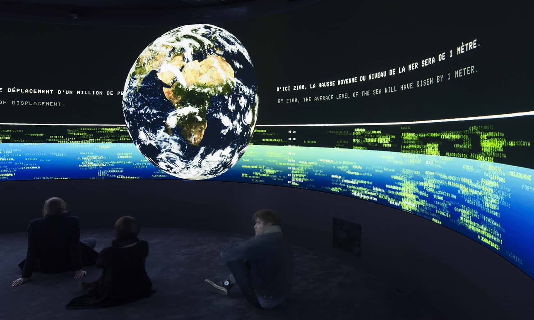
Art installation (surround video projection) This is an example of we’d rather not do. The content is rich but the visualisation style feels very old school. It was intentional, but we’ve since then shifted in aesthetics, this feels too ‘cliché’ technological. It feels passive and dark.
Giorgia and Stefanie - Dear Data
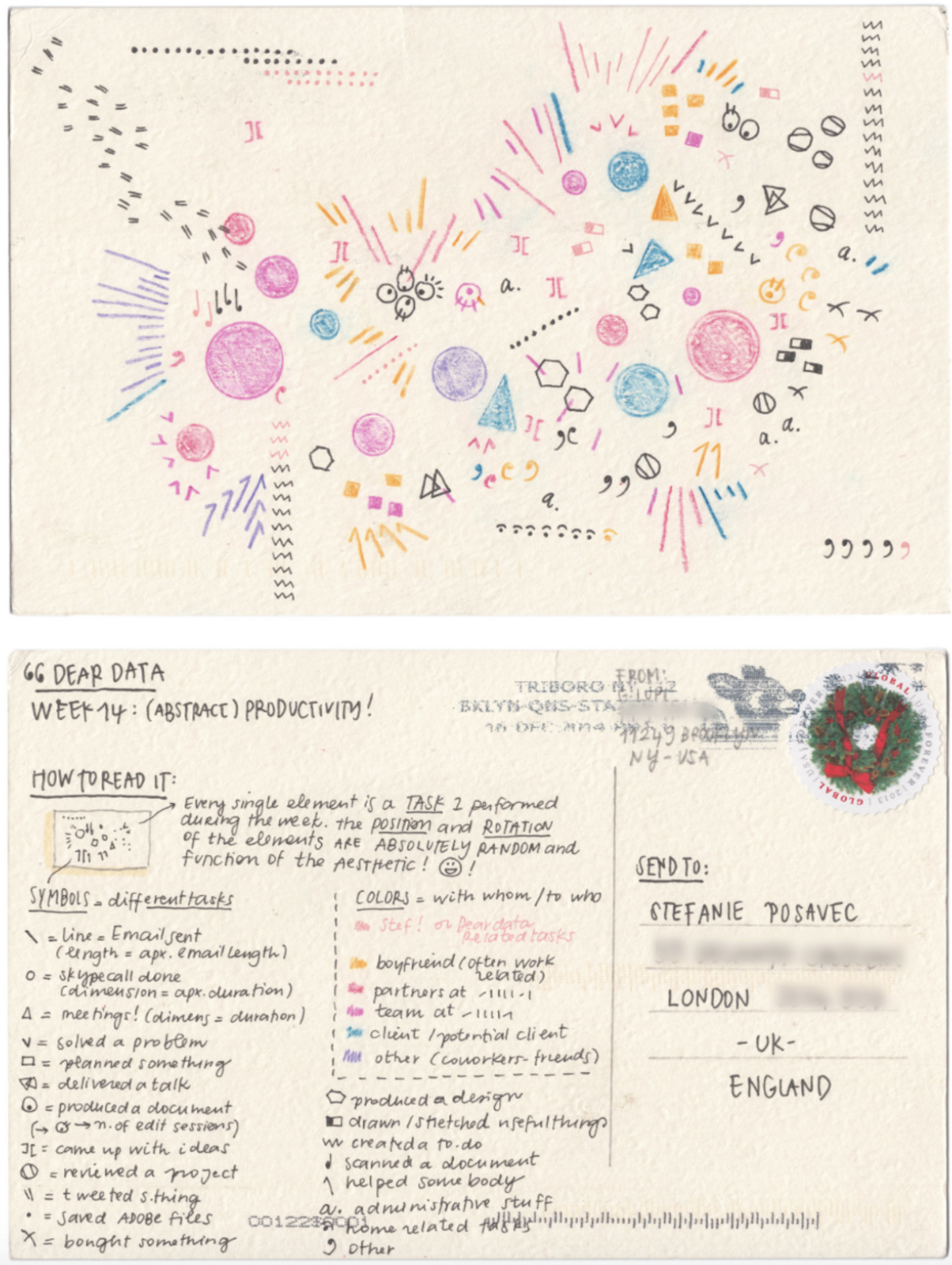
“Human” hand-collected and hand-drawn data visualization, which has an artistic touch.
Hexa / Grid Maps
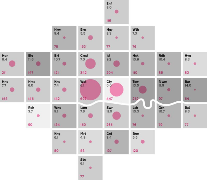
- https://clarity-us.com/data-viz-maps-hex-appeal/
- https://forumone.com/ideas/good-data-visualization-practice-tile-grid-maps-0
And tech nerdiness to manage hexagons.
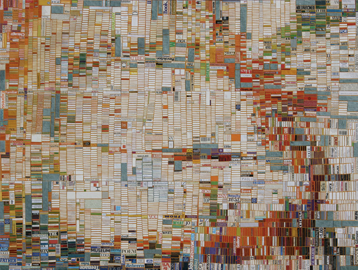
Ai Wei Wei
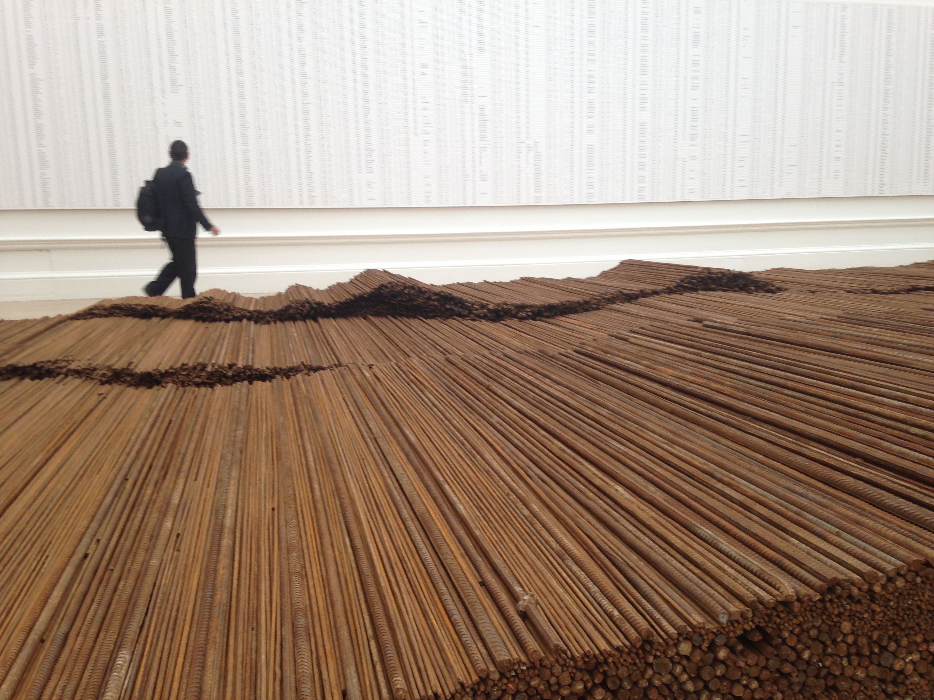
Strong material connection to the data. Data presented in raw format.
Laurie Frick
Visually appealing. Numbers translated to colours, physical manifestation of personal data. Using current data to predict future states.
Mona Chalabi - Data editor at the Guardian US
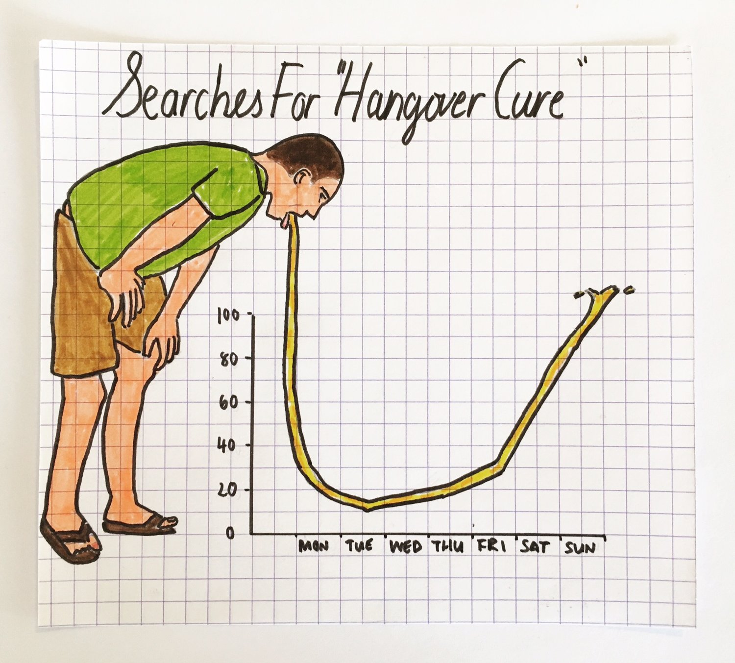
Using analog drawing to make data relatable, human and funny.
WeDoData - French data visualisation agency
2017 projects. Web platforms that do data visualisation on similar topics.
Gironde budget visualisation
Raw data turned into an editorialised, easily understandable document that can raise citizen awareness.
Bret Victor — Climate Change
Imprecise lines (one dot per ward instead of one dot (average) per town)
http://worrydream.com/#!/ClimateChange
Syria War Deaths - New York Times / Karen Yourish
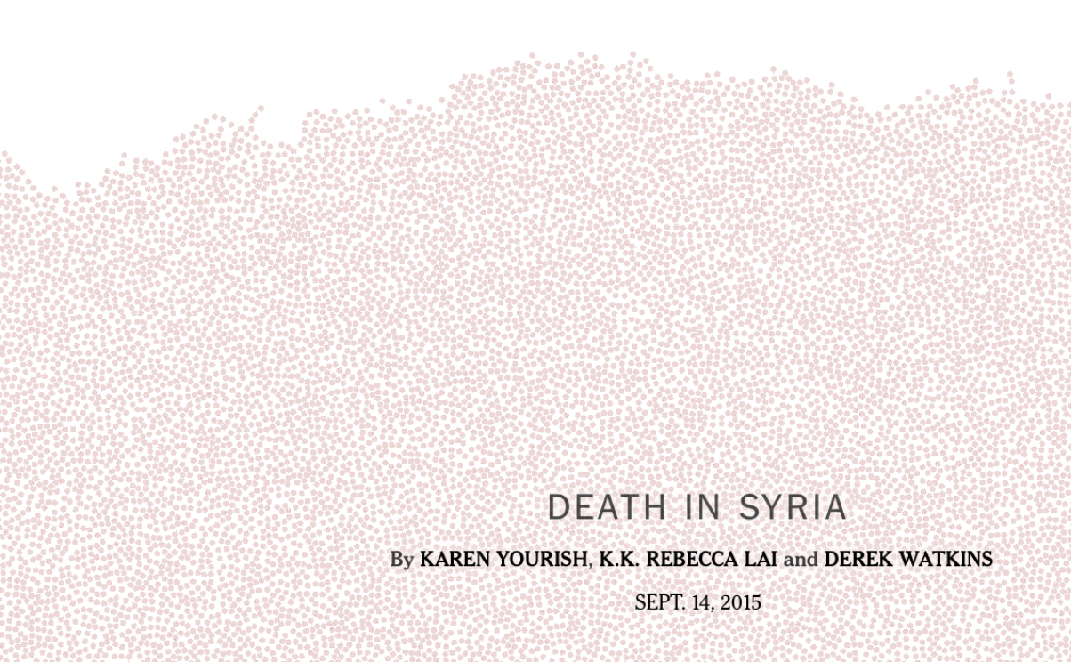
Scale and simplicity. Strong visual device brings weight and meaning to the numbers.
Data in the Street, by hand — Jose Duarte
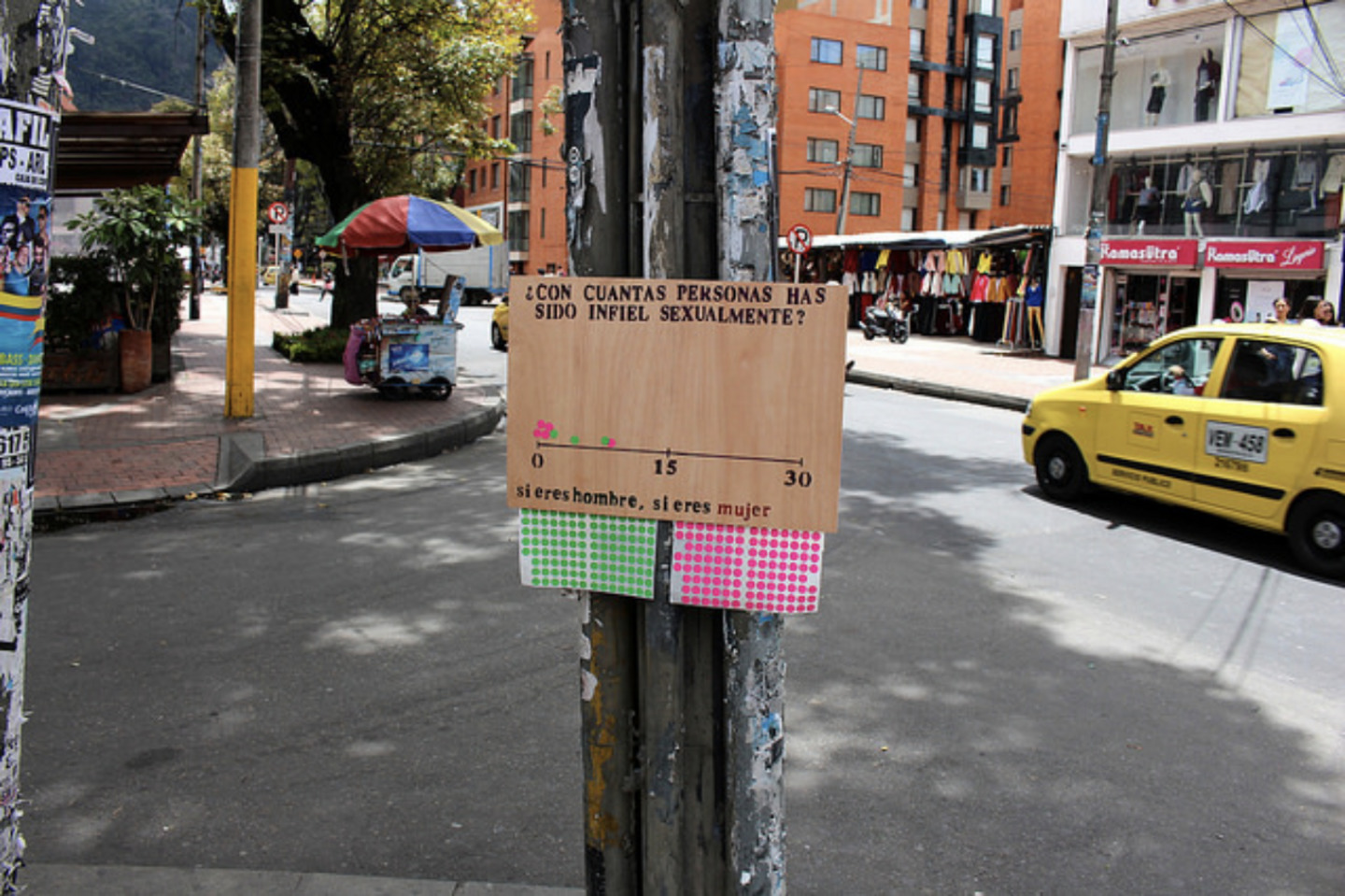
https://www.flickr.com/photos/joseduarteq/
London Situation Room - Future Cities Catapult

Not human or connected to reality. Over ambitious, glitchy interface.